Adashiko Brand Refresh
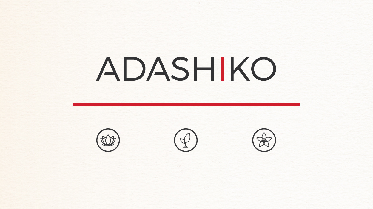
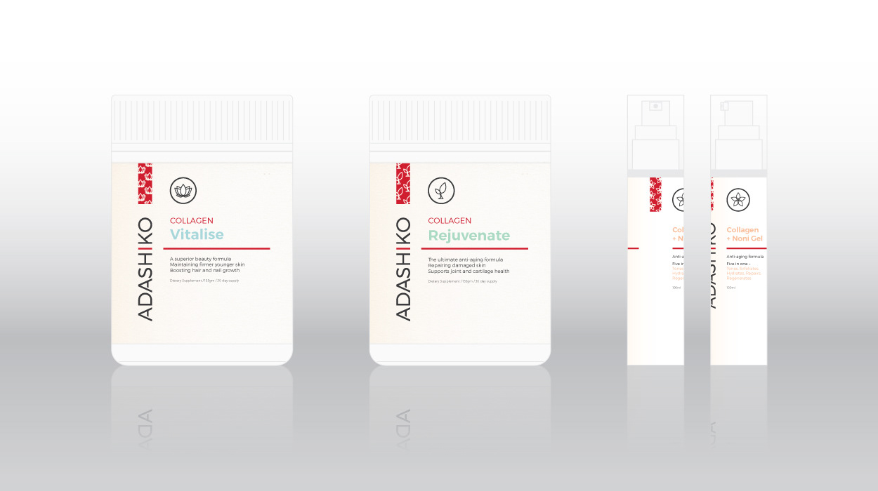
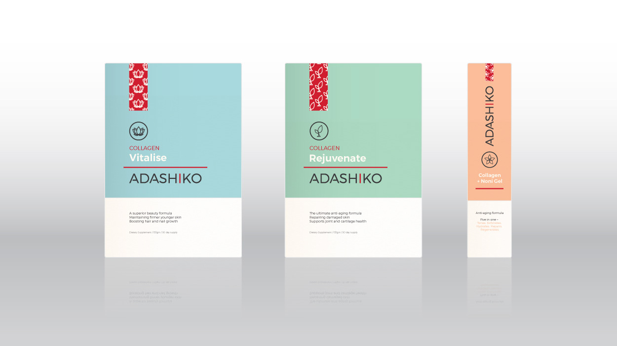
This re-brand touches on the product's Japanese origin, and the clean design style draws on the trust associated with pharmaceutical packaging. The red ‘I’ can be pulled out as a strong graphic element, and the branding is accompanied by three icons for each of the three products.
![](https://pro2-bar-s3-cdn-cf6.myportfolio.com/74d638b6034bfc4f67f4f79a703e0f32/7dbb84c3f9dfed7e130f0e47_rw_1920.jpg?h=1d93c3084c4d7458bbc1890edee479f5)
![](https://pro2-bar-s3-cdn-cf4.myportfolio.com/74d638b6034bfc4f67f4f79a703e0f32/f4e1c49268862545ac4ccb2e_rw_1920.jpg?h=2c39fc94e740252909a94bf0fac606aa)
![](https://pro2-bar-s3-cdn-cf1.myportfolio.com/74d638b6034bfc4f67f4f79a703e0f32/9ae72c7b37e5e8d662f9f17e_rw_1920.jpg?h=0b782e1cc1e12e912e4859e3588c4fa1)
![](https://pro2-bar-s3-cdn-cf3.myportfolio.com/74d638b6034bfc4f67f4f79a703e0f32/45345ad735354327b2277346_rw_1920.jpg?h=899a610beec97ad9d56ed12062ee340e)
![](https://pro2-bar-s3-cdn-cf2.myportfolio.com/74d638b6034bfc4f67f4f79a703e0f32/d9d402cbd72838d06638a029_rw_1920.jpg?h=4640ae2e9e9858ad60ae9147b4ad19d2)